

Led the end-to-end design of RS Personal Alarm, a personal safety app for lone workers.
flagship product
As the sole designer, I led end-to-end design, drove key marketing initiatives and ensured accurate implementation with the development team
With a growing number of clients, the app attracted one of Germany’s largest chemical companies and is set to roll out by the end of the year
At rising systems, we made a bold shift from service-based work to building our own digital products. RS Personal Alarm was our flagship, a mobile app designed to protect lone workers in industries like chemicals, pharmaceuticals and industrial manufacturing. I joined as Lead Designer and was the only designer on the project at the outset.
The team included a Product Owner and an engineering team, but there was no design system, no existing product infrastructure and no prior product experience within the company. I was responsible for all design work across more than 6 security-related apps, with RS Personal Alarm as my primary focus.
Beyond design, I also owned SEO strategy, Google Ads campaigns, product page creation, app store submissions and served as the main point of contact across teams.
I conducted multiple UX audits of comparable apps and services, identifying effective patterns as well as recurring pain points. The most impactful insight was that simplicity isn’t just a design preference for this context—it’s a safety requirement, and ultimately the most critical takeaway.
Lone workers in environments with low light, vibration, protective eyewear and physical hazards cannot afford cognitive load or visual clutter.
Every unnecessary element on screen is a potential source of confusion in an emergency.
This informed my entire design approach: high color contrast for readability in low light or when wearing safety glasses, a minimum text size of 20px across all non-settings screens to ensure legibility during movement or machine operation and the removal of any interface element that did not directly serve the user's safety workflow.
Every interaction pattern was evaluated through the lens of safety and German regulations, rather than relying solely on conventional usability heuristics. As a result, I reintroduced a slide-to-cancel interaction for dismissing active alarms, reducing the risk of accidental alarm cancellation.
Option A: Standard button to cancel alarms
Easier to implement and aligns with typical mobile UX patterns. Lower motor skill requirement. But prototype feedback and competitor audits revealed that accidental taps were a frequent and dangerous problem in the field.
Option B: Slide-to-cancel interaction
Requires more deliberate motor input, which conventional UX argues is a drawback. However, for lone workers wearing gloves, operating machinery, or moving through hazardous spaces, this friction is a feature, not a bug.
What I chose and why
I chose the slider. Canceling an alarm should require intentional, deliberate action. This decision was validated during prototype testing with 6 potential customers, who specifically praised the slider and reported that accidental clicks were a real problem with other apps and alarm devices they had used.
With this safety-first framework in mind, I designed RS Personal Alarm as a stripped-back, high-contrast mobile app where every screen serves a single clear purpose. The initial MVP was built from internal workshops and market research that identified the core feature set, which I then validated through a basic prototype shown to multiple potential customers. After receiving positive feedback and converting that interest into sales momentum, I created a presentation for the sales team that helped confirm the direction and secure buy-in to move into full design and development.
Working closely with the Product Owner, we finalized the feature set and I designed all user flows, eadge cases and detailed UI. By this point, I had hired a second product designer and established design guidelines to maintain consistency across the app and all customer-facing touchpoints. Together with the development team, we refined the app efficiently, followed by extensive automated and manual testing before a successful relaunch.
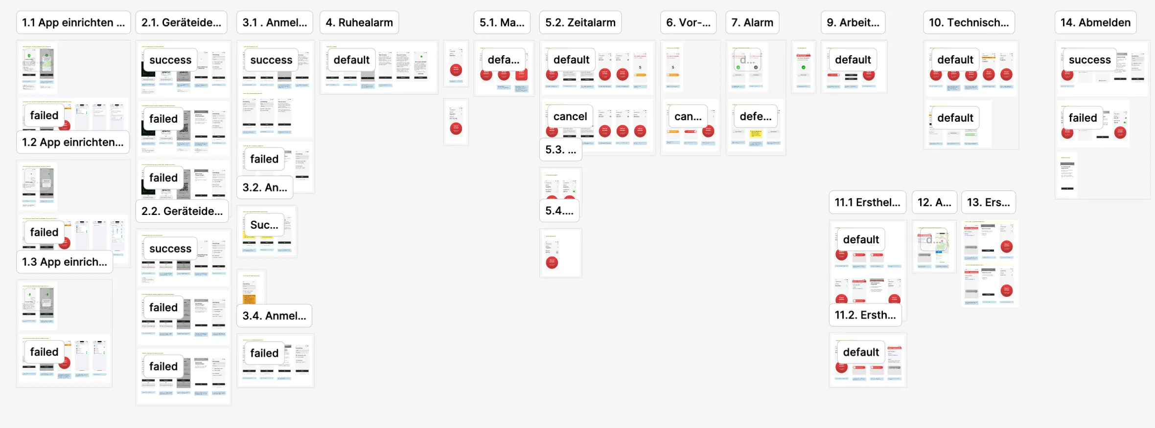
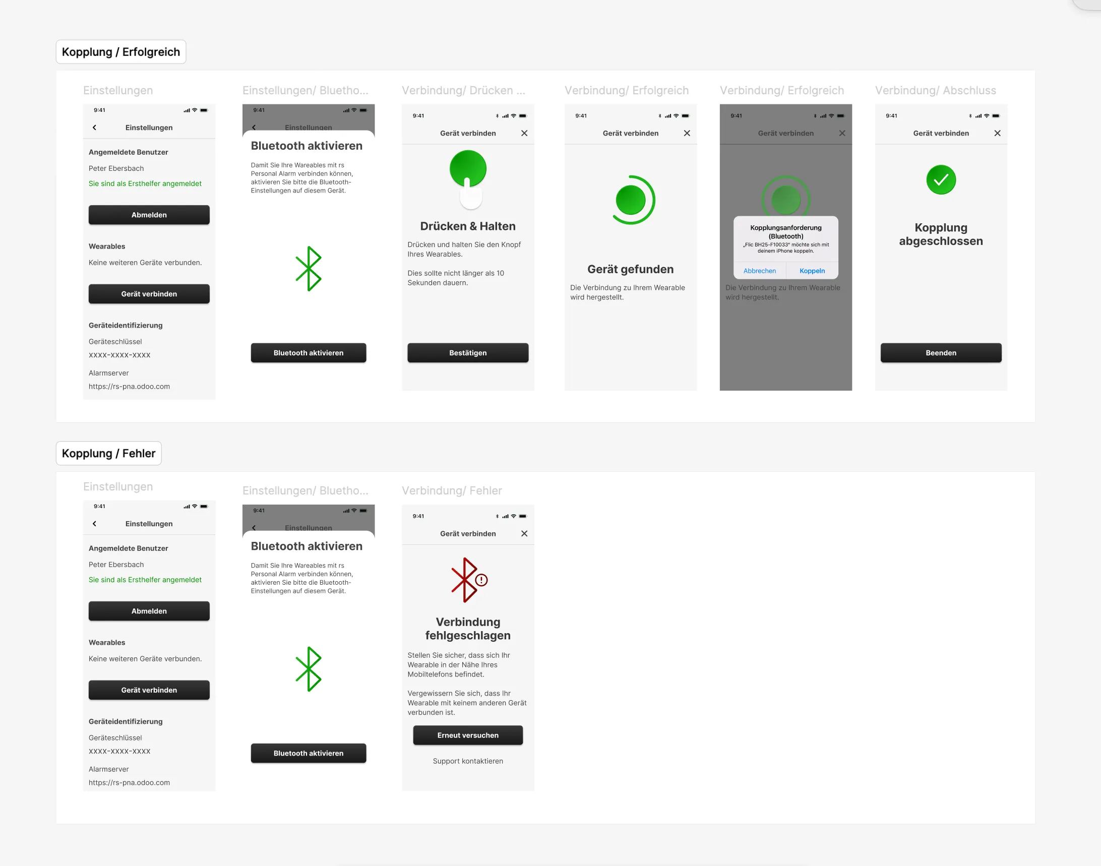
For the go-live phase, I defined and executed a discovery-driven SEO strategy based on keyword research, ensuring alignment with acquisition goals. I led the design and content development of the product page, crafting visuals and copy to clearly communicate value and support conversion. I also coordinated the app store submissions, ensuring a consistent and user-centered presentation across both Apple and Android platforms.
To enhance the user experience, I tracked user behavior using tools like Hotjar and Plausible, using the insights to make data-driven improvements to both the product page content and ad campaigns.
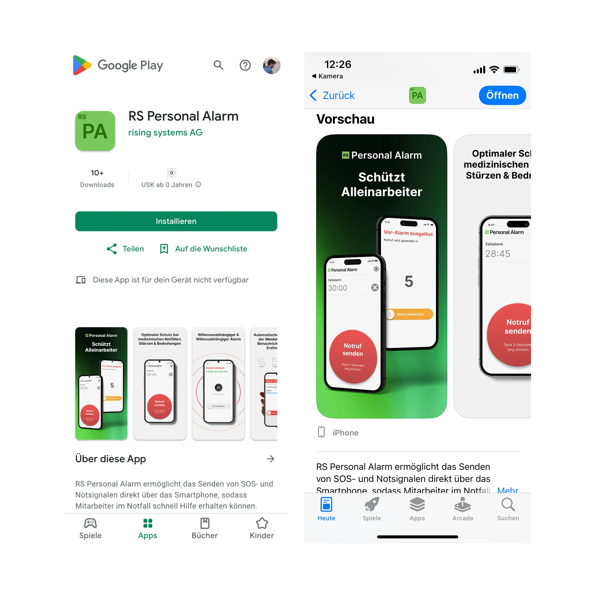
As the sole designer from day one, I led the entire design process end-to-end, took ownership of key marketing initiatives and ensured accurate implementation in close collaboration with the development team.
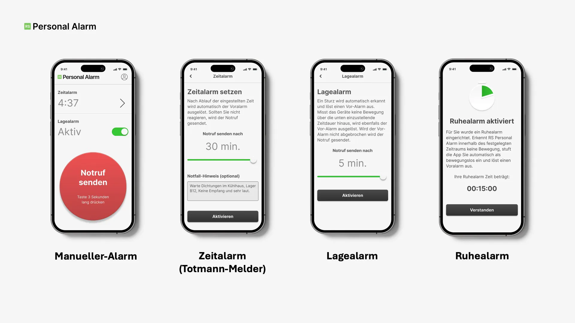
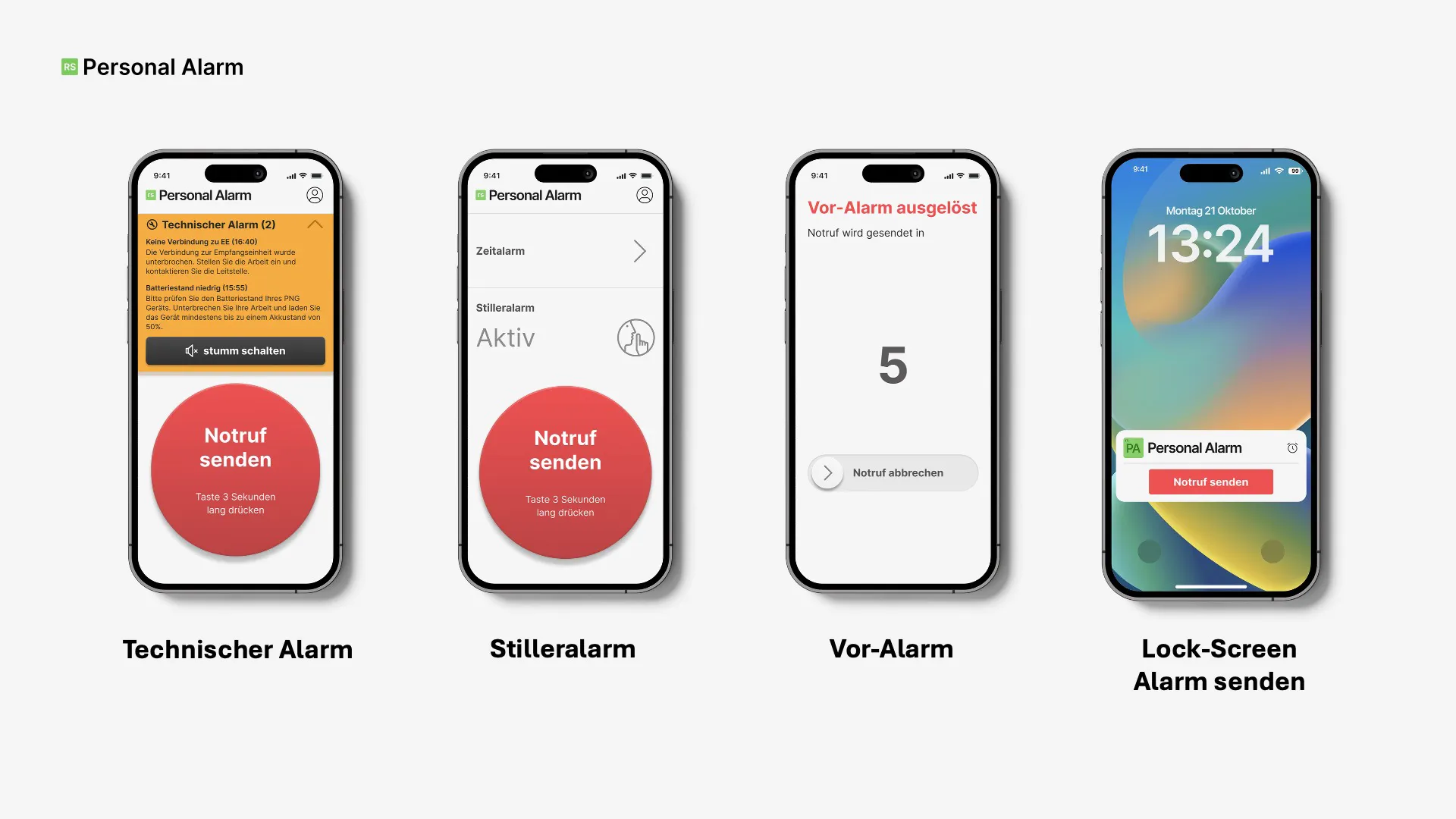
As a result of the design work, sales enablement and iterative improvements, RS Personal Alarm moved from concept to a product trusted by one of Germany's largest chemical companies.
My favourite success stories
Discover how we transformed ART COLOGNE’s failed digital attempt into a thriving platform for VIPs, galleries and visitors.
highest customer happiness score
18% more platform engagement
13% reduced application time
16% improved team efficiency
From 0 revenue to reaching the desperately needed milestone in 3 weeks.
312% more sign ups
60% less bounce rate
80% reduced offer creating time

