From 0 revenue to reaching the desperately needed milestone in 3 weeks.
312% more sign ups
60% less bounce rate
80% reduced offer creating time
Revamped Laidback Bet’s early-stage product to address trust and usability issues, after first failure
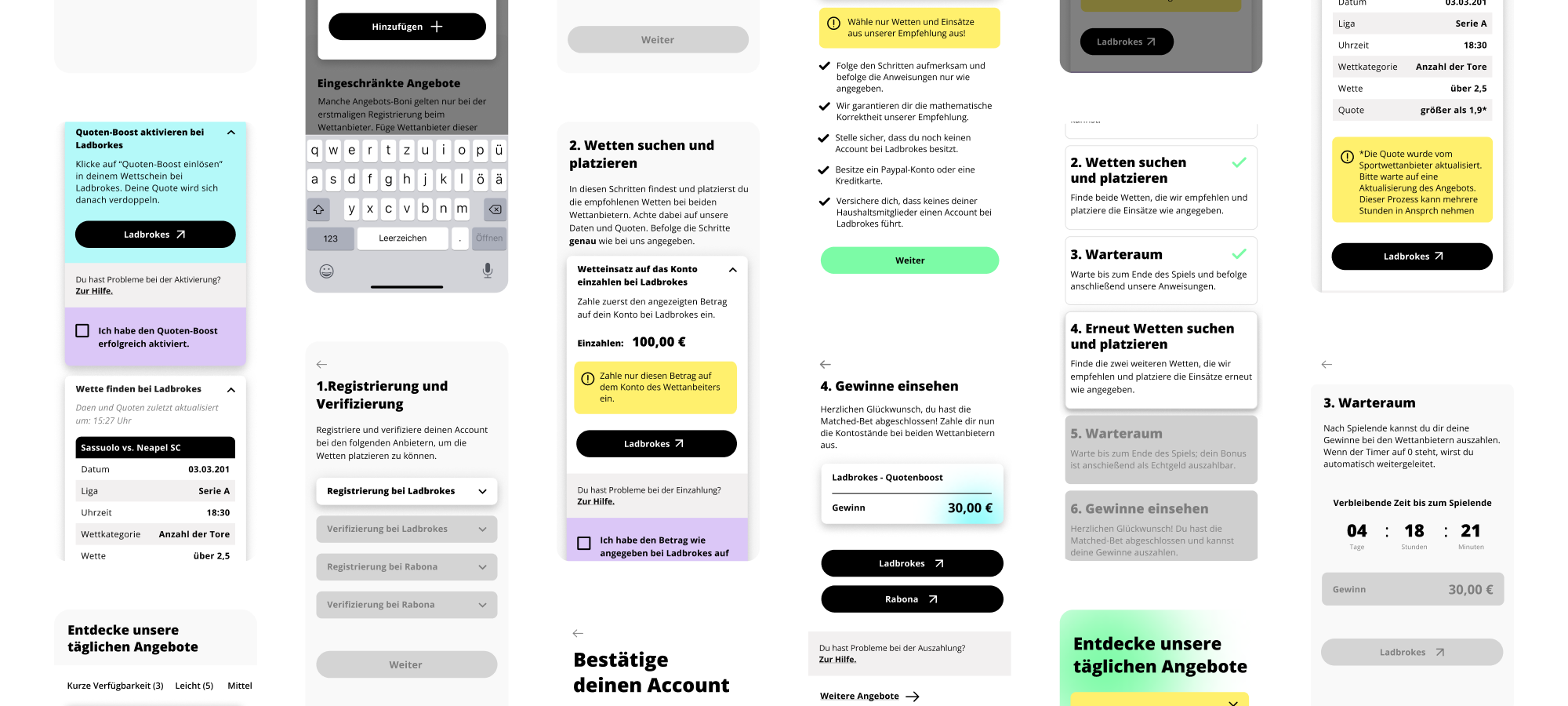
Created a quotation Builder that cut manual effort from hours to 30 minutes while shipping on time
As a result, the next milestone was achieved and the first five-figure revenue was reached
Imagine launching a product and learning that nearly every person who encounters it assumes it is fraudulent. That was the reality at Laidback Bet, a matched betting startup with an innovative approach but almost no paying customers.
The product worked, but it looked and felt like an early prototype with no recognizable brand, confusing instructions, and no trust signals. Users landed on the page, hesitated and left.
Laidback Bet was a small matched betting service targeting a young, German-speaking audience. The product guided users through a series of highly individualized steps to place matched bets for guaranteed profit.
I joined as the team's first and only designer. The team was small: a product owner and a development team. There was no design system, no brand identity, no established UX process. The product existed as a functioning but visually raw MVP.
We had three weeks to ship a complete redesign before a critical business deadline, and the development team's capacity was limited, so every design decision had to be technically feasible and tightly scoped.


To understand the real problem, I ran a 25-person survey and conducted five online user interviews. Participants were recruited by the product owner from within our target demographic. The results were stark and consistent. 90% of participants said they believed the service was a scam. When I dug into why, three connected signals emerged.
No recognizable brand
Without a name, logo, or visual identity that felt professional, users immediately associated the product with low-effort scam sites. The absence of branding was not just an aesthetic gap; it was an active trust destroyer.
Unclear guidance through the flow
Users did not know what to do next at almost every step. The flow lacked structure and clear instructions, which made people feel unsure and vulnerable, exactly the wrong emotion for a product that involves real money.
Prototype appearance
The raw, unfinished feel of the interface reinforced the impression that this was not a legitimate business. Users interpreted the lack of polish as a lack of investment and credibility.
This insight forced a clear strategic choice. With only three weeks, I could not redesign everything. I had to decide where to focus.
Option A: Expand features to increase value proposition
We considered adding more betting options and advanced tools to make the product more compelling. But research showed that users never got far enough to evaluate features. They bounced because they did not trust the product at first glance.
Option B: Rebuild trust through brand, flow and content
I chose to focus entirely on trust and clarity. This meant a new brand identity, a redesigned user flow and rewritten guidance content. We gave up feature expansion entirely for this itteration.
Quotation Builder over full automation
The quotation step was a major bottleneck. Each user's workflow was so individualized that full automation was technically infeasible for the MVP. Instead of delaying, I designed a Quotation Builder that kept the human in the loop but reduced the manual process from hours to roughly 30 minutes.
We traded perfect automation for a pragmatic tool that shipped on time.


Building on the decision to prioritize trust, I redesigned the entire product experience in three weeks. The result was a service that looked, read, and behaved like a legitimate, polished product rather than an experiment. I created a complete brand identity, including a new name, logo, color palette, and modern typeface, that gave Laidback Bet an approachable and positive personality.
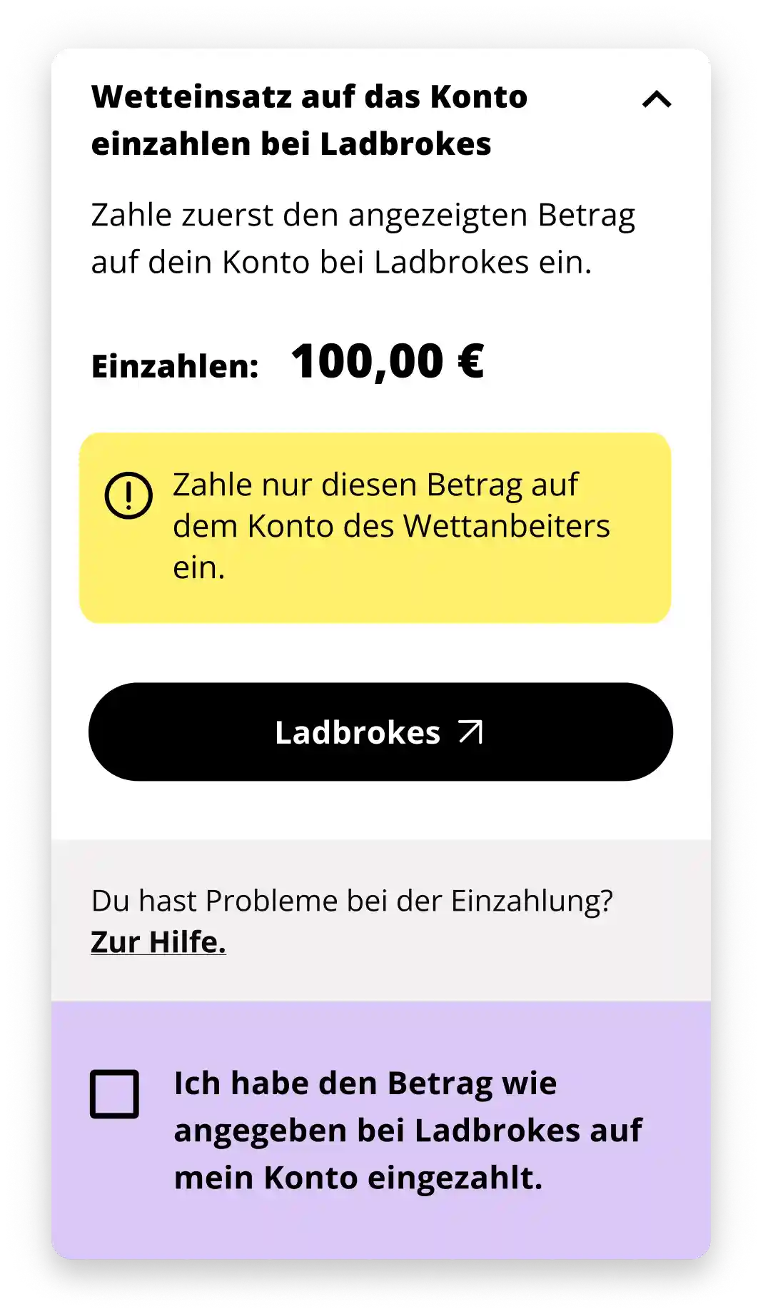
The user flow was rebuilt from the ground up in close collaboration with the product owner and development team, ensuring every step was clear, technically feasible and aligned with the timeline. I rewrote the majority of the product's instructions and simplified and unified the help sections so users always knew what to do next.
The Quotation Builder I designed replaced a painful, hours-long manual process with a structured tool that significantly reduced effort for both the team and users.The experience was responsive across all devices, and the overall tone shifted from confusing and suspicious to transparent and trustworthy.



As the only designer on the team, I was responsible for every design deliverable from start to finish. I planned and conducted the research, including the survey design and the five user interviews. I created the complete brand identity: name exploration, logo, color palette, and typography.
I designed the end-to-end user flow, all UI screens across devices, the Quotation Builder, and I rewrote the product's instructional content and help sections. The product owner recruited research participants and provided domain expertise on the quotation logic. The development team built and shipped the product.
But the entire design surface, from research through brand through interface through content, was mine.
As a result of the redesign, Laidback Bet saw a meaningful shift in performance. Sign-ups and started offers increased after the relaunch. The product reached its first five-figure revenue milestone shortly after going live, and then hit a second major revenue milestone.
The Quotation Builder reduced the manual quotation process from hours to approximately 30 minutes. The project was ultimately cancelled at the end of 2025 due to legal changes in the German betting market, not because of product performance.
My Favourite Success Stories
Discover how we transformed ART COLOGNE’s failed digital attempt into a thriving platform for VIPs, galleries and visitors.
highest customer happiness score
18% more platform engagement
13% reduced application time
16% improved team efficiency
Led the end-to-end design of RS Personal Alarm, a personal safety app for lone workers.
flagship product