Designed a web application that digitized motor skills assessments across more than 800 schools in Germany.
Used in >800 schools
>30 user tests
2x awarded
Sole designer of a flexible, tablet-based web app digitizing sports testing in Germany
Responsible for end-to-end design, conducting over 30 user tests
Over 800 schools use the app for motorskill assements
Every year, the Düsseldorf Sports Office tests every child from first to tenth grade across the city's schools for motor skills and mobility. All of it was done with pen and paper. Results were recorded on forms during gym sessions, then manually transferred into Excel sheets and eventually into a CMS.
For examiners working with classes of young children in noisy gyms, the paper process was slow, error-prone and created a bottleneck that rippled through the entire system. Parental consent forms and medical information followed the same fragile chain. The Sports Office needed a digital solution, but the real challenge was building something that could survive the chaos of a live testing session with first-graders.
The project was part of a larger initiative to digitise the world of sport in Düsseldorf and this app was one of the first pieces. I was the only designer, responsible for the complete design of a tablet-based web app that would replace the paper testing workflow. I worked alongside a small development team and one project manager.
The examiners who would be using the app had widely varying technical skills and the tablets they carried were small. The app had to work in different gyms where the order of exercises changed every session, so flexibility was a hard requirement. There was no existing design system to build on.
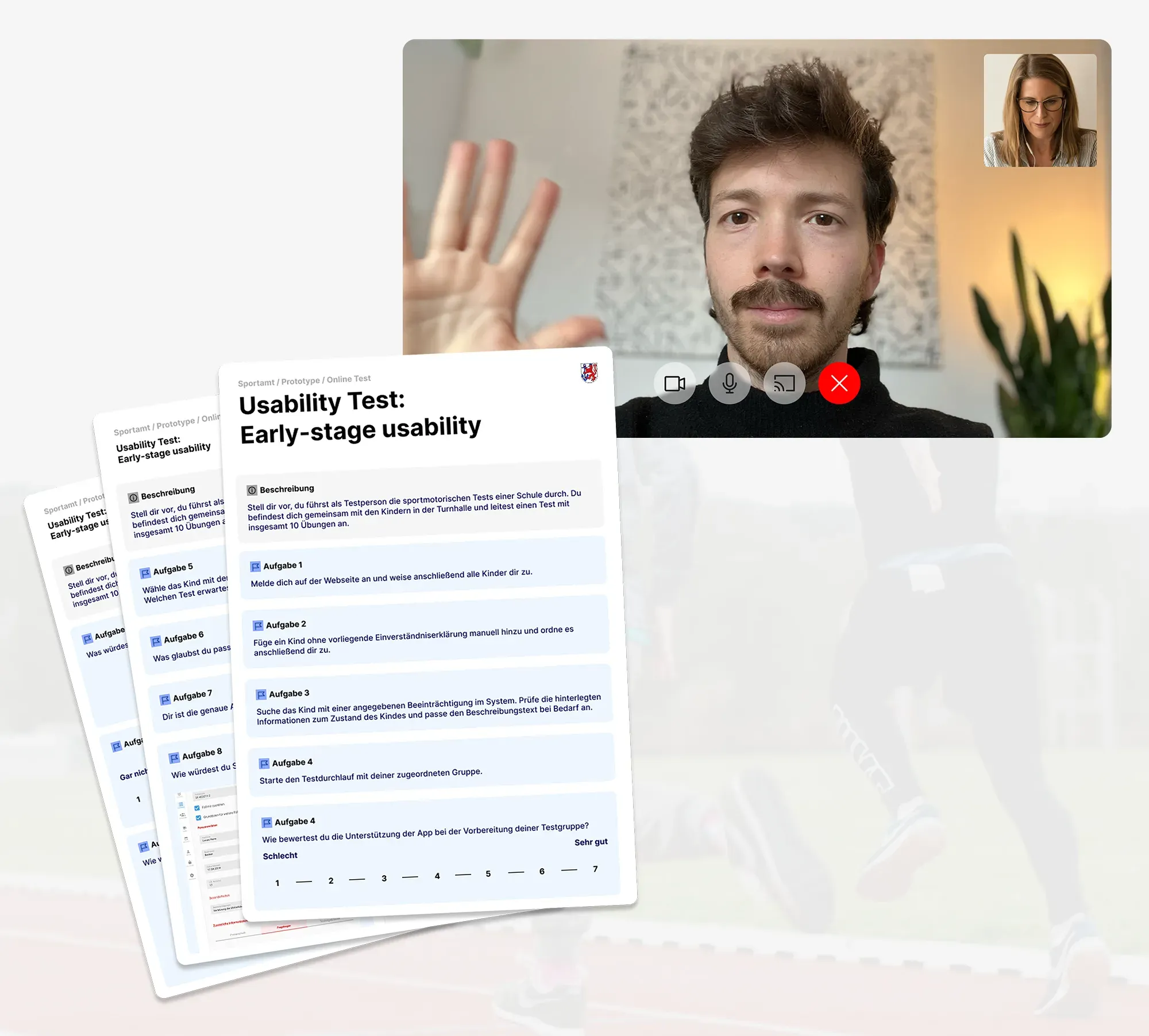
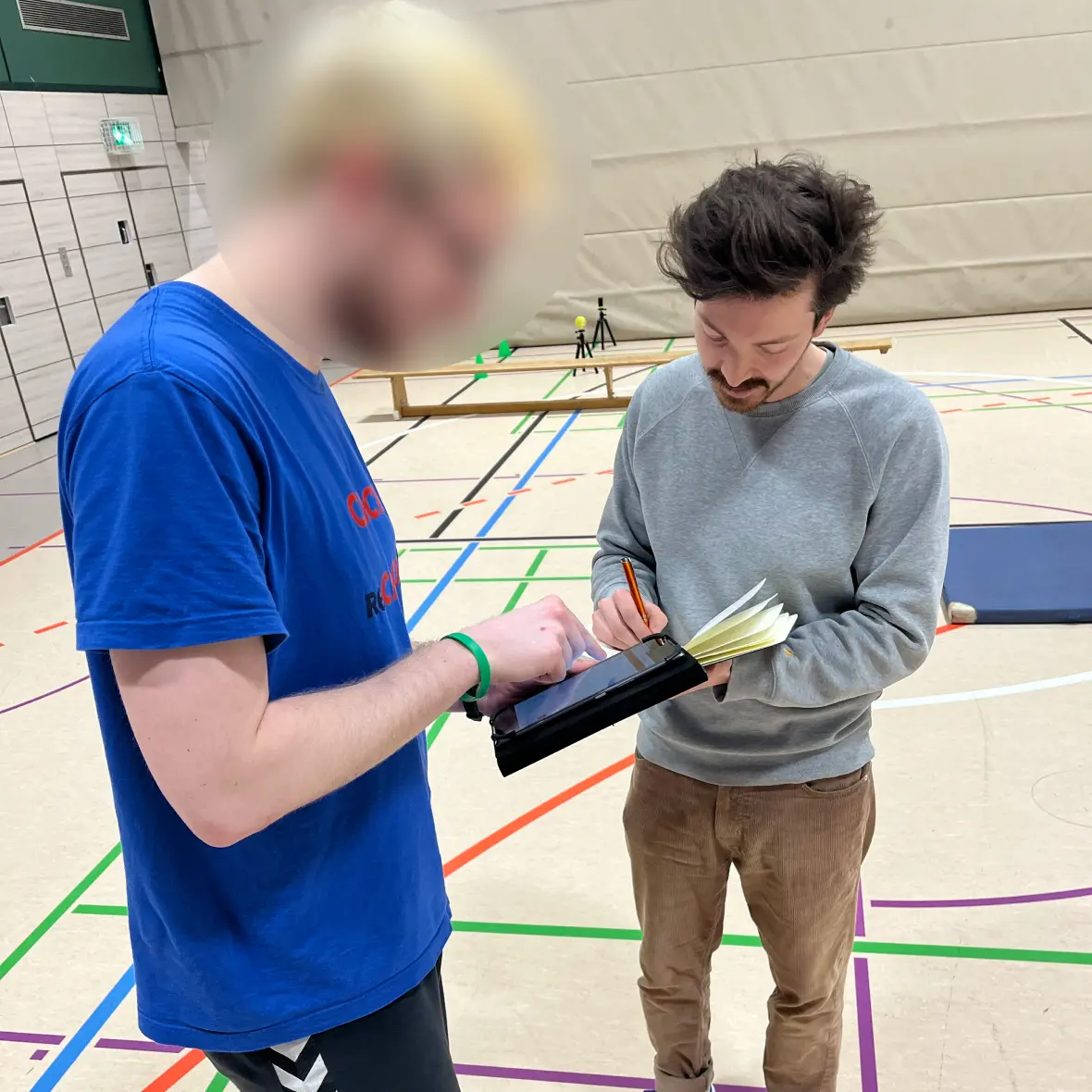
To understand the real conditions, I conducted 30 moderated user interviews with platform users and ran 6 unmoderated shadowing sessions during live testing events. We did not isolate key tasks - instead we tested the entire process start to finish in real gym environments to get the most accurate picture possible.
Tap targets were too generous
I had designed large clickable areas and icons to make the app forgiving on small tablets. During live tests, it became clear the elements were actually too big - they consumed screen space examiners needed for other information. This led to a full rework of component sizing to balance touch friendliness with information density.
The next-button insight that changed input speed
I observed that examiners strongly preferred using the keyboard's built-in next button to advance between fields rather than tapping each one manually. This gave me a further idea: skip the next button entirely by auto-advancing the cursor to the next input field after each technically valid entry. This one change considerably increased the speed of recording results in subsequent sessions.
Educational animations failed in practice
Animated exercise demonstrations were a favourite feature among stakeholders. But in live sessions with primary school children, putting the tablet in their hands did not go well. More importantly, trained examiners explained exercises far more effectively than any animation could.
I removed the animations entirely to reclaim screen space for information that actually mattered during testing.


These insights forced several deliberate trade-offs that shaped the final product.
Minimal design vs feature-rich interface
Given the wide range of technical skills among examiners, I chose to strip the interface down to only well-known standard UI patterns. We gave up the ability to surface more advanced features in favour of an app that anyone could pick up and use confidently in a loud gym. This meant some workflows required more taps, but the learning curve dropped significantly.
Removing animations vs keeping stakeholder favourites
Stakeholders loved the educational animations and saw them as a headline feature. After field testing proved they were counterproductive, I recommended removing them. We gave up a crowd-pleasing demo feature in exchange for a faster, more focused tool that matched how examiners actually worked.
Auto-advance vs manual field navigation
Rather than keeping the standard next-button flow that examiners already used, I proposed auto-advancing after valid entries. The trade-off was less explicit user control - examiners could no longer pause between fields as easily. But the speed gain in a time-pressured environment made this the right call, and subsequent testing confirmed it.


Building on these field-tested insights, the final product was a tablet-optimised web app that replaced the entire pen-and-paper workflow. Examiners could now gather and adapt all pupil information on site, record exercise results in real time with auto-advancing input fields and handle the dynamic order of tests that different gyms required. The interface used increased text sizes, appropriately sized touch targets refined from live testing and only standard interaction patterns to keep the learning curve flat.
All results flowed directly into the Sportamt database, eliminating the manual transfer chain from paper to Excel to CMS. Parental consent and medical information were digitised alongside the test data. The app was designed to be resilient to the realities of the environment: noisy gyms, distracted children, time pressure and examiners with limited tech experience.


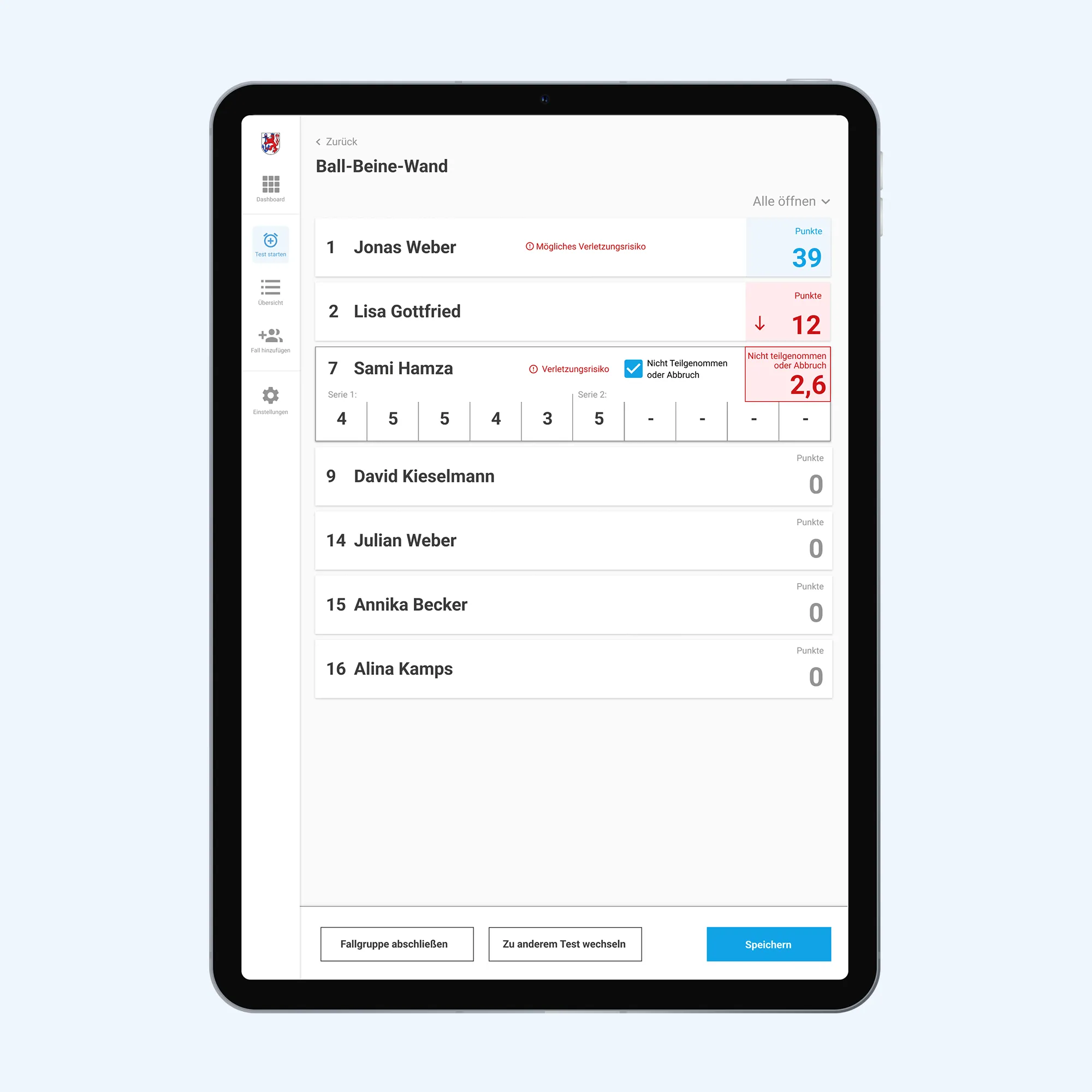
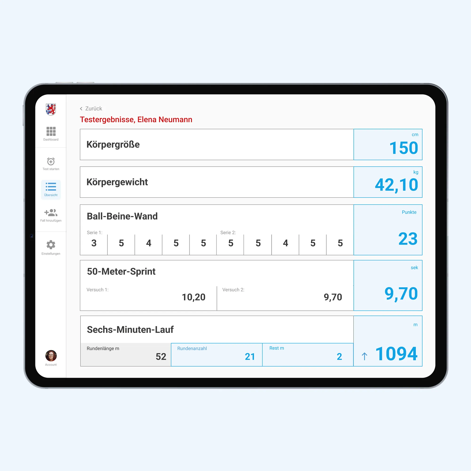


As the only designer, I owned the end-to-end design of both the tablet app used during testing and the platform used for administration. I managed stakeholder expectations throughout the project, led all design decisions and was directly responsible for the research that shaped the product.
I planned and conducted 30 moderated user interviews and 6 unmoderated shadowing sessions during live testing events.When findings contradicted stakeholder preferences - like the animation removal - I made the case and drove the decision.
The development team handled all engineering, and the project manager coordinated timelines and logistics. I worked closely with both to ensure design decisions were technically feasible and shipped correctly.
Following the first successful adoption by the Sports Office in Düsseldorf, I oversaw further rollouts and itterations across six additional districts and handled custom design requests tailored to their specific needs.
As a result of this work, many districts moved from a fully manual paper-and-Excel process to a digital system that feeds directly into their database.
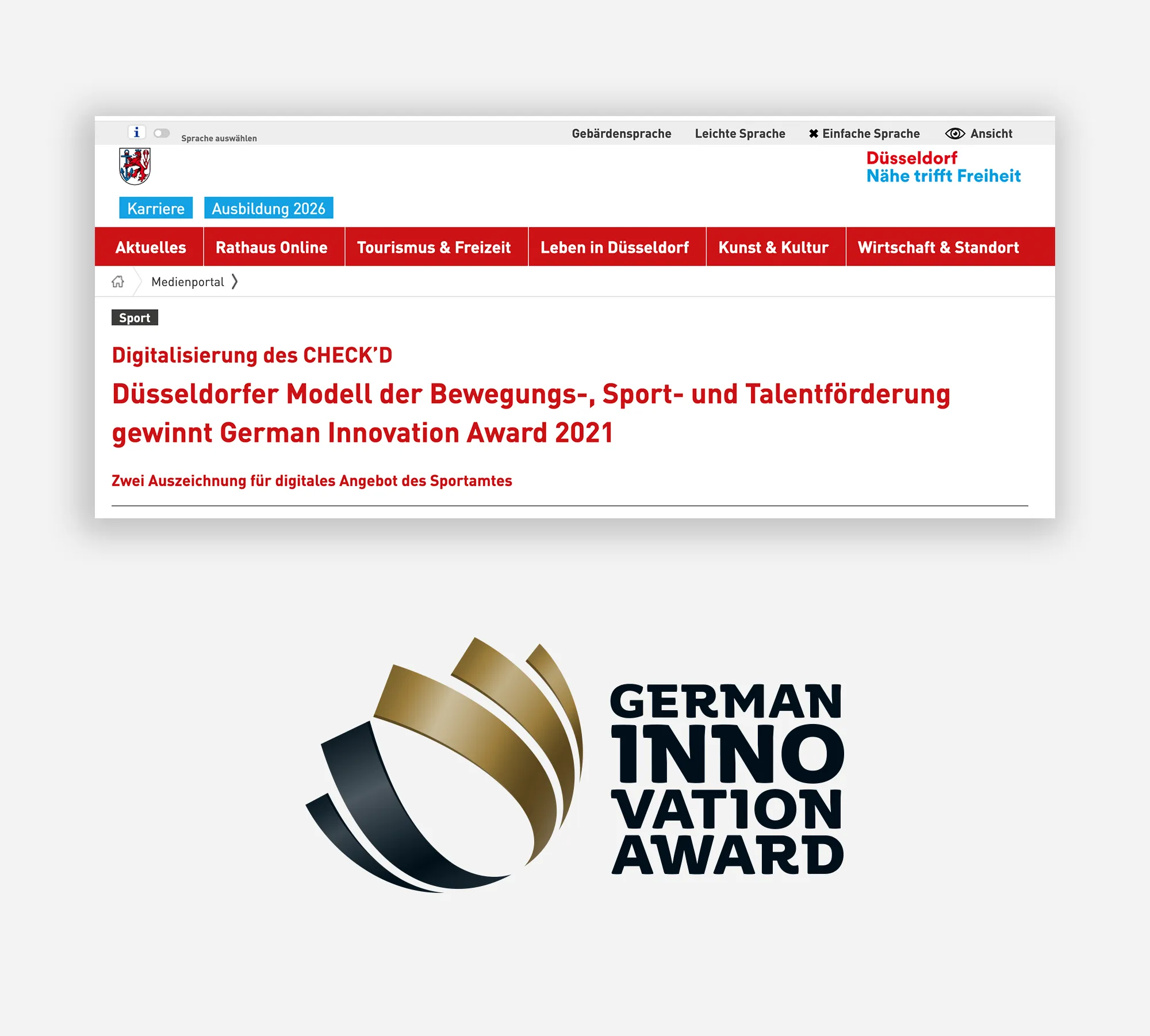
The CHECK'D app was recognized as the first solution officially adopted by multiple cities, distinguished by its approach to analyzing motor skills data and visualizing insights within a dedicated sports portal.
This project worked because a small team stayed close to the problem. Our project manager kept stakeholder communication and logistics on track, which gave me the space to focus on design and research. The development team built everything I designed and were flexible when field testing forced us to rework components, and add missing features.
The Sportamt staff who participated in shadowing sessions and interviews were generous with their time and honest about what was and was not working - their candour made the product better. This was a particularly instructive project for me and I am grateful to everyone who helped make it real.
My favourite success stories
Led the end-to-end design of RS Personal Alarm, a personal safety app for lone workers.
flagship product
From 0 revenue to reaching the desperately needed milestone in 3 weeks.
312% more sign ups
60% less bounce rate
80% reduced offer creating time

